From 2017 to 2022, One More Turn worked on a myriad of corporate, commercial and self-initiated projects which saw an evolution to our brand identity. When it came to OMT’s brand identity across various channels and platforms, there was a clash between being ‘minimal’ (film-like, minimalistic, modern) and a more ‘brutalist’ (edgy, hard-edged) style. OMT‘s aim, values, and services has changed over the years — and thus there was a need to undergo a brand refresh in 2022. The brutalist and serif nature of the previous logo and logotype was bygone, and there was a need to transition towards a more contemporary identity. In addition, it was essential to inject some vibrancy and a sense of energy to OMT’s identity, whilst moving towards a direction where OMT’s logo/symbol and brand identity is more direct, modern, and accessible for clients and the general public to understand.

A mix of Old (unchanged) and New Colours
The corporate colour of OMT is now dark grey, a timeless, practical, and unbiased colour. It is accompanied by the opposites of white and black. With a young and creative team that is expanding, there was also a need to move towards a fun, vibrant and energetic brand identity. Thus, six different colours (secondary brand colours) are being introduced alongside the primary corporate colours. These colours are inspired by the RYB colour wheel seen universally, especially in the arts, creative and media industry.
Basic, neutral colours in the form of grey, white and black were chosen for the branding to ensure that the logo will be suited for any projects undertaken, and not have any aesthetic clashes. These colours can be used in almost all scenarios.
These secondary brand colours can be used in various scenarios such as holiday celebrations and special occasions, or when OMT wants to convey a particular mood or tone of voice. The colours have been carefully chosen to be colorblind friendly.

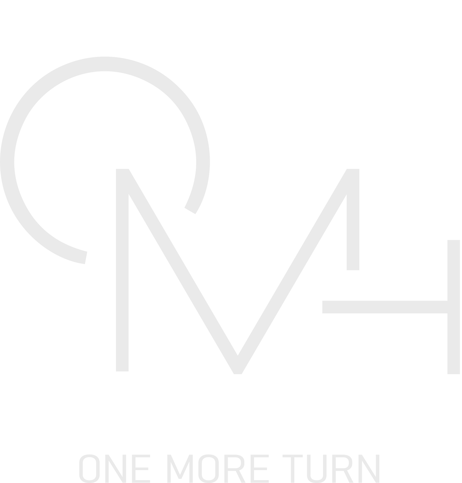
OMT’s new logo
The new logo is an elegant, modern and a professional way to showcase OMT’s focus; storytelling and filmmaking. The logo is also multi-layered as it contains ‘parts’ where the audience has to decipher artistically. The letters ‘O’ ‘M’ and ‘T’ is the short abbreviation for One More Turn. This abbreviation is now synonymous with the brand’s identity. The curve in the form of a ‘C’ on the top right and the line ‘_’ at the bottom forms a video camera with OMT as the centrepiece. The formation of this video camera is subtle for some, and direct for others. It illustrates OMT’s focus as a brand for storytelling and filmmaking.

Creative Variations for OMT Logo
Being in the creative field, one key consideration when crafting the logo was to ensure that it functions with a myriad of creative treatments. The design of the logo allows it to be superimposed on different photo-based backgrounds, on gradients and multi-coloured backgrounds, while being highly visible for all audiences to view.
Bahnschrift is a sans serif font developed by Microsoft. The font is highly legible, versatile and customisable. The font’s width and thickness can be edited almost continuously from thin to bold. Used in One More Turn’s main logotype, the typeface has been customised to resemble a medley between IBM Plex Sans and IBM Plex Mono. The logotype’s weight is ‘SemiLight SemiCondensed’, with a weight of 400 and width of 100, with -10 Tracking. The typeface has also been manually compressed and customised to give a more legible and prominent finish to be used in the brand’s primary logotype, horizontal lock-up and other supplementary branding.

Horizontal lock-up for OMT’s new brand identity
While OMT’s logotype is displayed below the main logo in a supplementary manner, the logotype can also be used on it’s own as a secondary graphic. It is reconstructed in a contemporary approach to pay homage to OMT’s previous logo and logotype (from 2017-2022). As seen below, the line in the logo or icon can be extended to be used as a secondary graphic for OMT’s branding. The horizontal lock-up can be used on both digital and printed collaterals, such as pitches and decks, namecards, internal and external documents, etc.
The primary typeface for One More Turn, IBM Plex Sans is neutral & technical, with some carryover from monospace fonts. Similar to the fonts used in scripts, it subtly suggests at filmmaking. Apart from legibility, IBM Plex Sans also has a modern and clean look suitable for both long and short copy. The font also has a myriad of weights ranging from Thin to Bold. IBM Plex Sans should be used in body copy and for most marketing collaterals, decks and proposals, and other documents for external usage. The medium to bold weights of IBM Plex Sans could also be ultilised for headers and footers. The full monospace alternative to IBM Plex Sans, IBM Plex Mono feels incredibly technical and is a staple of the film industry. It is versatile and pairs well with both IBM Plex Sans and, One More Turn’s logotype Bahnschrift. The font also has a myriad of weights ranging from Thin to Bold. The IBM Plex Mono should be used in headers, footers and other technical details.
When crafting OMT’s logo and brand identity, one key element was ensuring that the logo can be animated in various ways. Thus, OMT’s logo design was created to contain of a ‘sum of parts.’ Incorporating animation with OMT’s logo can create a vibrant and energetic visual appeal as compared to a static logo.